Courtenay Healing
branding, digital, print
Continuously learning more for the purpose of helping people improve their health, Ross and Brigitte have been running their little Vancouver Island based healing centre for over two decades.
Having been around for a while Courtenay Healing Centre’s visuals were very dated and didn’t have a proper web presence. Wanting to reach out to more people who need help, provide educational services on integrative therapies and starting community initiatives, they were ready to invest in a new image and online home for their brand.
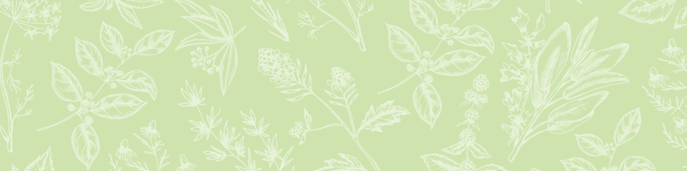
The main wordmark and type has circular features, representing balance, and features a plant illustration, showcasing their approach to herbal medicine and down-to-earth and compassionate ways. Various herbal illustrations are used throughout the printed and online assets, creating a welcoming and natural environment. Inspired by the beautiful outdoors of the pacific north west the colour scheme features a light blue and various tones of green, from a light ever green to a mid-tone spruce to a dark mossy green.
The design work displayed here was created while under contract with Goatsocial.
The present state of the brand may have been modified from its original design and as such may no longer represent the original concept. Shown below is the original re-brand and site design.

Related design projects