motion theater
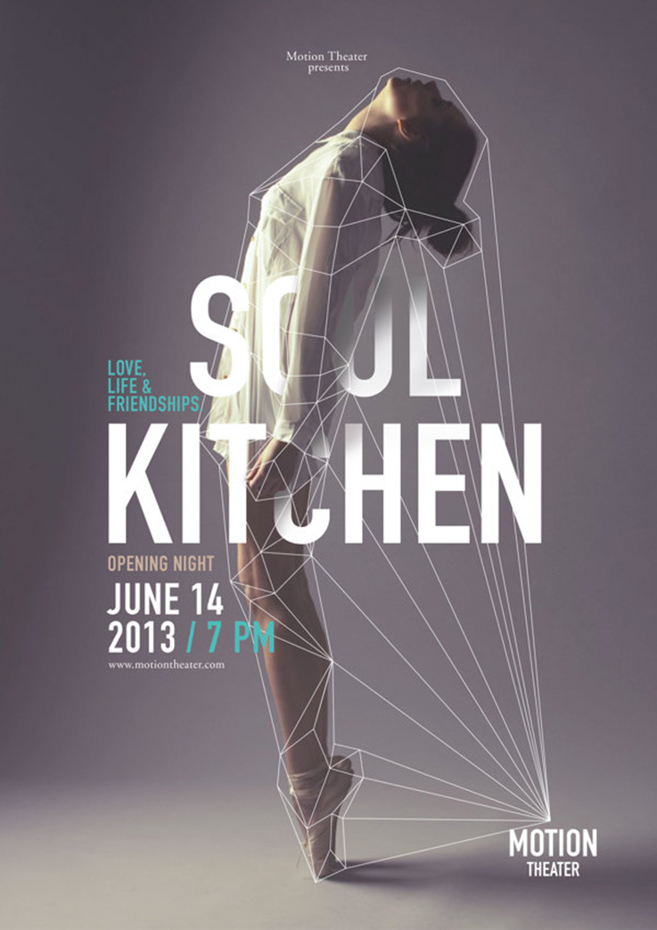
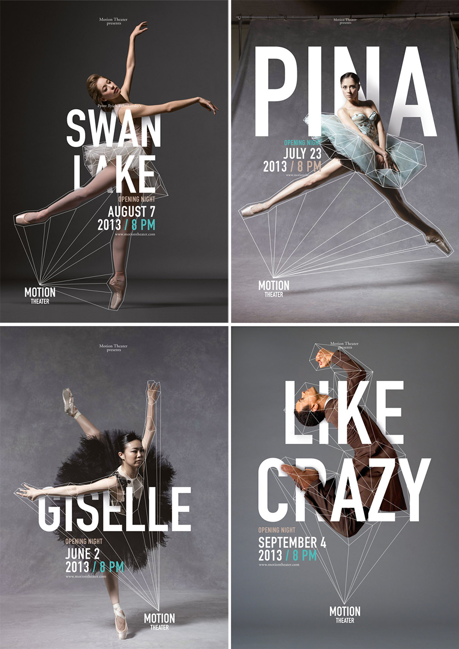
I’m not sure what it is about dance and ballet but it absolutely fasinates me. In the past I have often used ballet posters and photoshoots as inspiration for other projects I am working on (such as this one). I came across the branding Caroline Grohs did for the Motion Theater the other day and was immediately in love. I love the way she tackled the overall brand, how the logo wraps and modifies along with the dancers in an elegant and dynamic way. Even the type interacts with the dancers and manages to really draw in the reader. It also reminded me of Stefan Sagmeister’s branding project a few years ago for Casa da Musica in Porto.
Be sure to check out the rest of the materials Caroline Grohs designed for Motion Theater on her portfolio. If you enjoy dance and ballet take a few minutes to watch this little video made for the The Australian Ballet (it still gives me the chills). I also highly recommend watching First Position and Pina on Netflix.


Oh, I’ve been seeing these lovely designs around and I LOVE them! I have to check out the video!
Branding well done :)
Ok, I cannot get enough of all of the dancing and type designs that are happening. The geometric elements in these definitely stand out to me. Thanks for sharing dear!
No problem :) I love the dynamic in these.
Oh my gosh, I absolutely adore these poster designs, they’re seriously stunning!
I did ballet for years, loved it but eventually decided it wasn’t for me, but I’d never seen that video, it’s really lovely!
Glad you liked it :) I never did ballet but am so impressed by it!